How to Prompt Claude & Codex for Good UI Designs
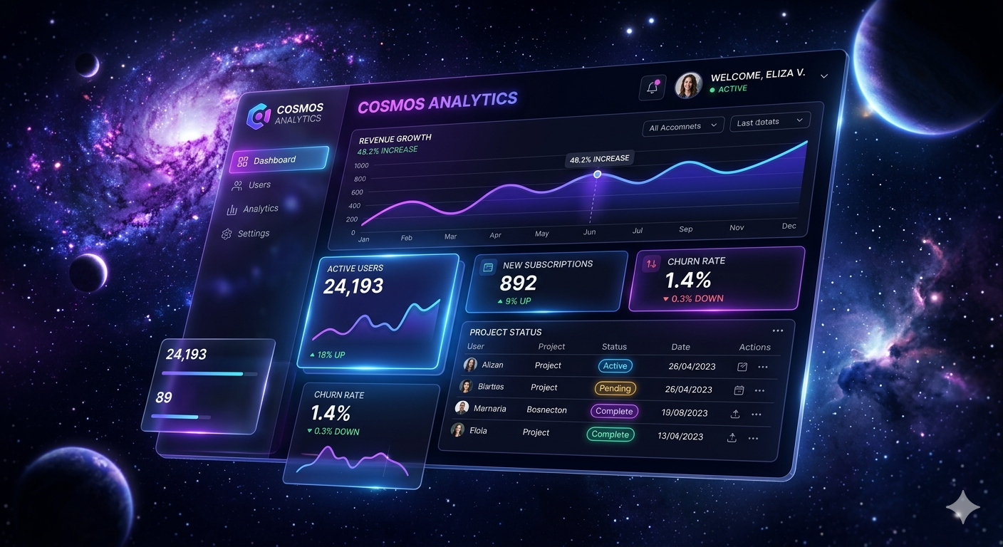
AI coding tools are powerful — but left to their own devices, they produce generic, forgettable interfaces. The secret is in how you describe what you want. Here's exactly how to write prompts that push Claude and Codex toward design quality you'd actually ship.
Why AI-generated UIs look samey
Claude and Codex are incredible engineers. They'll write clean, accessible, well-structured HTML and CSS. But their default aesthetic instincts are trained on the average of the internet — which means blue gradients, rounded cards, Inter font, and a hero section with a purple CTA.
The problem isn't capability. It's that you haven't told them what taste looks like. These models respond brilliantly to constraints, references, and direction — the same way a talented contractor builds differently when you say "mid-century modern with walnut accents" versus "just make it nice."
AI tools don't lack taste — they lack your taste. The more precisely you describe your aesthetic intention, the closer the output gets to something worth shipping.
The four layers every prompt needs
Good design prompts for AI work in layers. Miss any one of them and the output drifts. Think of it like a brief you'd give a junior designer — context first, direction second, constraints third, examples last.
Layer 1: What it is + who uses it
Start with the function and audience. "A dashboard for freelance designers to track invoice status" gives the AI more usable design signal than "a dashboard." Audience determines density, tone, and complexity.
Layer 2: Aesthetic direction
This is the part most people skip. Name an aesthetic explicitly. Vague words like "modern" or "clean" are noise. Specific ones like "editorial, tight margins, lots of white space, monochrome with a single warm accent" produce real results.
Layer 3: Typography + color constraints
Specify fonts and palette if you have preferences. If you don't specify, the AI will reach for Inter and Tailwind's default blue. Mention your brand's hex code, or point to a palette system. Tell it what not to use if relevant.
Layer 4: References or comp descriptions
You can't paste an image into a coding prompt — but you can describe one. "Similar vibe to Linear's onboarding: dark, dense, monospace accents" is a reference the model understands. Name sites, tools, or aesthetics you admire.
Real prompts you can copy and adapt
These are structured templates for Claude and Codex. They follow the four-layer structure above. Swap the variables in brackets for your project specifics.
# Role + Context
You are a senior product designer and frontend engineer.
Build a [COMPONENT TYPE] for [PRODUCT / USER TYPE].

# Aesthetic Direction
Design aesthetic: [e.g. editorial minimalism / brutalist / warm and organic]
Mood: [e.g. serious and dense / playful and airy / luxurious and quiet]
Avoid: Inter font, purple gradients, generic SaaS look.

# Typography + Color
Primary font: [e.g. DM Serif Display for headings, DM Sans for body]
Accent color: [e.g. #c84b2f — use sparingly]
Background: [e.g. warm off-white, not pure white]

# Technical
Output: HTML + CSS in a single file, no frameworks.
Responsive: yes. Animations: subtle only.
Reference feel: [e.g. Stripe's documentation / Notion's sidebar / Linear's UI]
# Context
Build a landing page for [PRODUCT NAME].
Product: [one-sentence description]
Target user: [e.g. indie hackers / enterprise buyers / creative professionals]

# Design Direction
Aesthetic: [e.g. retro-futuristic with geometric patterns]
Typography: [e.g. bold serif headings, condensed sans for labels]
Color system:
  --background: #f5f1eb
  --text: #1a1815
  --accent: #d4622a
  --muted: #8a8077

# Sections to include
- Hero with headline, subheadline, CTA
- 3 feature cards (icon + title + description)
- One testimonial or social proof block
- Simple footer

# Constraints
No stock photo placeholders. Use CSS shapes / abstract patterns instead.
No blue. The accent color (#d4622a) is the only non-neutral.
Animations: only on scroll, and subtle.
The difference a good prompt makes
Here's the same request phrased two ways. The output quality difference is significant — and the only thing that changed is the prompt.
"Make me a pricing card component. It should look good and be modern."
"Build a pricing card for a design tool. Aesthetic: editorial, B&W with a single terracotta accent (#c84b2f). Font: Playfair Display for plan name, 400-weight DM Sans for features. Border: 1px solid #e0d9cf. No rounded corners. No gradients. Price in large serif. Features as a plain list, no checkmarks."
The weak prompt produces a card that looks like every Tailwind UI component. The strong prompt produces something with a point of view — something that feels designed.
Design a settings page for a UI component library tool. Target users: solo developers who care about craft. Aesthetic: spare and technical — like a terminal but warmer. Font: JetBrains Mono throughout. Colors: dark background (#111), warm white text, soft amber highlights. Every interactive element should have visible focus states. No gradients, no shadows. Keep it dense — these users read docs for fun.
When to use which, and how to adapt
Claude and Codex have different strengths. Understanding this helps you lean into each one rather than writing one-size-fits-all prompts.
Claude (Anthropic)
Claude is strong at design reasoning — it can discuss tradeoffs, suggest aesthetic alternatives, and push back if your direction is inconsistent. Use it when you want a design partner, not just code output.
Claude responds well to narrative prompts. Describing the feel you want in a sentence or two ("this should feel like reading a good book, not like using software") often works better than a spec list.
Codex / GPT-4o
Codex is faster at executing explicit specs. It's better when you have a precise technical brief — exact pixel values, a component library to match, a defined system. It does less well at "figure out the aesthetic" and better at "implement this aesthetic."
Use Claude to design the system: tokens, aesthetic direction, component relationships. Then give Codex the spec Claude produced to build out the component-level code at speed.
Small changes, big results
-
1
Name what to avoid. "No drop shadows" or "avoid Inter font" gives the model useful negative space — it stops it from reaching for the nearest generic choice.
-
2
Use CSS variable names in your prompt. Writing
--color-accent: #c84b2fin the prompt means the model uses variables in the output, making your design system easier to maintain. -
3
Ask for a style guide first. Before asking for components, ask Claude to define your design tokens — spacing scale, type scale, color palette, border radius system. Components built on a system are more cohesive.
-
4
Iterate with specificity. First output not right? Don't say "make it better." Say "the heading is too big, reduce to 2rem. The CTA color should use the accent, not the ink color. Add 8px more padding inside the card."
-
5
Reference real products by name. "Similar to Vercel's dashboard density" or "the card style of Clerk's documentation" are references models understand well. Be specific — "Linear, but warmer" is better than "minimalist."
-
6
Ask for dark mode in the same pass. Retrofitting dark mode is painful. Prompt for it upfront using
prefers-color-schemeand CSS variables — Claude handles it cleanly when asked from the start.