The Death of Boring SaaS UI in 2026
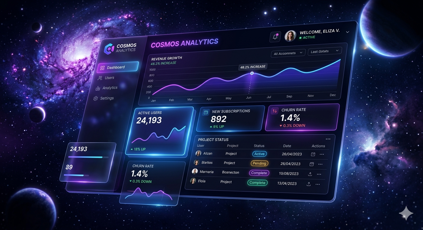
For years, SaaS websites looked identical. White backgrounds. Tiny buttons. Generic dashboards. Safe layouts. Developers optimized everything for “clean design,” but somewhere along the way, interfaces lost personality.
In 2026, users no longer remember clean products. They remember experiences.
The rise of motion UI, glassmorphism, neon gradients, animated borders, magnetic buttons, and cinematic landing pages proves that modern interfaces are becoming emotional instead of purely functional.
People don’t share boring UI screenshots anymore. They share interfaces that feel alive.
The biggest shift is psychological: users now associate animated interfaces with innovation. A static UI feels outdated even if the product itself is powerful.
This is why startups are investing heavily into:
- micro-interactions
- glowing hover states
- depth effects
- animated dashboards
- immersive onboarding
- AI-inspired futuristic visuals
But flashy UI alone is not enough.
The real challenge is balancing:
- performance
- accessibility
- responsiveness
- motion
- visual identity
The future belongs to interfaces that feel premium without sacrificing speed.
That’s exactly why modern Tailwind + React workflows are exploding. Developers want visually impressive UI that ships fast.
And honestly, nobody wants to spend 14 hours rebuilding buttons anymore